Friday, 26 June 2015

Spare room makeover


My concept board and picks of accessories.


In my last post, I showed you how an amazing feature wall, created by making a photo into wall paper through wallpapered, can be a great starting point when deciding on a room design...
In this post I will tell you all a bit more about my concept and design for our previously bland and uninspiring spare room....

Above you can see my concept design for the room makeover, featuring that amazing custom made wall paper that I designed, using my friend Kristine Scott's amazing coastal photograph, and below you can see how the room used to look:


When we bought the house 3 years ago, it was OK....livable, but only OK, not to my taste, decor wise!
It had some great features, and as they say "good bones", but was rather bland and unadventurous!
The last room in the house still reminding me of it's previous state, the spare room, was not the worst offender: With a rather nice fireplace feature and a perfectly unoffensive lilac color on the walls it has not been top of my priorities....
....but aside from housing guests, it's uses has been limited and it has ended up becoming the dumping ground in the house: The room where everything I didn't need or want around was stored, and I would shut the door and forget about it!
Hands up who else has a room like this in their home!

With that gorgeous pixilated image covering the entire wall where the bed is, I am making a BIG artistic statement in here, and really setting the scene for the room. 
That wall paper is the STAR of this makeover, so everything else is going to have to compliment it in a very subtle way!

As with all the other floors upstairs in our home, I've decided to paint it white. (See my tutorial on how to paint wooden flooring to see how) And I was lucky to already have a tin of paint (Leftover from when I did my daughter, Mia's room makeover) that was a good match to the top of the image on the wall paper.

So the makeover is already under way, and I've actually finished painting the room.
Now I need to add all those little things that make a room come together:


Another important part of this room design, is to keep accessories to the minimum .
This will also help not to steal any thunder from the feature wall, and prevent the room from looking too busy and cluttered!
But this does not mean that the accessories is any less important:
For the mood board, above, I've carefully chosen some simple, but fun and well designed pieces that will help me set the tone for that relaxing atmosphere that I want to create:

I've been lusting after the Z1 cotton lamp by Nelson Sepulveda for ages now, but unfortunately it is way out of my budget, so , in true Nostalgiecat style: Expect a DIY option to this coming on the blog soon.

The paint color, Crown Seldom Seen, is a calm, almost white pale grey, and I love it!

When the lovely people at Lighting majestic contacted me to see if I wanted to choose a light to do a product review of, I literally spent days perusing their huge selection of lights....When I came across the Blyton range by DAR , I fell in love: The pale wood, with the unusual tree-like design and the "old- fisherman's-metal-pendant-style" shades I instantly knew that the Blyton floor lamp  was the perfect choice for my new-look spare room! It had just the right amount of  hint of seaside about it!!

I know that the Ombre-effect is out of trend now, but I am not one for slavishly following trends, and I may DIY some curtains like these, as I feel this effect will perfectly compliment my scheme!

Another top of my lust list, is the string pocket shelving. I am really trying to stretch my budget for these, but I've got a feeling I may have to find a suitable compromise here...

I already own one of these House doctor natural baskets, and plan to use it to house a green plant to brighten the interiors with! "Shopping your own home" and reusing things you've already got, in a new space or maybe even in a new way, is a great way to change up your interiors when the budget is tight!

Another top of my wishlist, has been this gorgeous round ,brass House Doctor mirror  , and I was lucky enough to get one sent to me from one of my favorite online shops, Not On The High Street...
I love the simplicity of the design and think it will look fantastic in the room!

That's it!
Simple and calm...
Apart from the odd decorative accessory, maybe a plant or two, I don't feel like this room will need much more that this, as I want that wallpaper to be the star attraction....and the less stuff that's in there, the more calming and inviting the space will feel.
But I am turning the old boiler cupboard into a book shelf, so that I can keep my reading material readily available when I get a moment to retreat into this room for some relaxation!


Tuesday, 23 June 2015

Creating a feature wall....

Make your own wallpaper

I am redecorating our spare bedroom!
It is the last room in our home ( well apart from the bathroom....but that's a job for the pro's I think) that has not yet had the Nostalgiecat treatment!

I've  decided to give this room more of a purpose....with a creative makeover that will give it the WOW factor!
I want to turn it into a calming retreat, where I can curl up with a book and take a breather, AND provide overnight guests with a comfortable and beautiful place to stay!

I'm not usually one for overtly themed rooms, but with this room, I want to create a calm and fresh atmosphere, drawing on my Scandinavian coastal roots.

A great starting point when coming up with a room design for a makeover, is a feature of some sort....I love starting with art : this helps me determine both color scheme and the look and feel of a space!
And building on my recent obsession of displaying art in my home, I decided that I wanted to make a BIG statement on the wall behind the bed (which is staying in the room until the budget allows for an update)....

So, when my very talented photographer friend, Kristine Scott posted this picture (below) she had taken of waves crashing in on the shore of Norway, locally to where I am from, I got in touch with her straight away, and she kindly agreed to let me borrow her image for this project.


I love the colors and the movement in this photograph, and I just know it is going to be perfect for the look and feel I am after for the spare room!
You can see more of Kristine Scott's beautiful coastal photography on her Flickr page, and she also makes the most amazing nature inspired silver jewelry, that you can purchase here.

So , armed with this beautiful image, but not knowing how to transfer it onto the wall... I was over the moon when the lovely people at wallpapered contacted me, proposing a collaboration. It was as though it was meant to be, and we decided to turn the image into wall paper to cover the wall behind the bed in it's entirety!

If you have been reading Nostalgiecat for a while, and followed my recent series of posts on Displaying art in your home ( here, here and here) you will know that in my opinion art is the number one ingredient to a personal home....and nothing makes a more confident statement than huge art, and covering an entire wall with artwork in the form of wall paper has to be the ultimate commitment to your personal tastes!

As much as I loved Kristine's image of the waves, I decided I wanted a slightly more painterly effect.  So I used Lunapic, a free online image editing tool, to play with the image, and decided to pixelate the it, so that it will be more like an abstract piece of art, like below:


I also mirrored the image, so that the bed will not cover it too much, and lose some of the expression ...
After having played around with the image in this way and decided on the effect I wanted to create, I uploaded the original high resolution file of the image using make your own wallpaper.
Then I emailed my pixilated image design to the design team at wallpapered, who then worked with me to create the effect I was after, to turn it into a wall paper.

You can upload any image you'd like, as long as it is a high resolution file, and by using make your own wallpaper you can even see a preview of what it's going to look like.

 The design team at Wallpapered is very helpful and will work with you to get the best result possible, regardless of whether you want an effect, like I did, or not, to create the perfect feature wall for your home!

 There is also the option of searching their photolia gallery for over 1 million images ready to use to create your very own wall paper, should you not have an image of your own, as well as a wast array of  wall murals, like brick-effects and maps.


Here's a BEFORE picture of the wall in question:


With that gorgeous pixilated image covering the entire wall where the bed is, I am making a BIG artistic statement in here, and really setting the scene for the room.
Here's a concept board I've put together to show you how it's going to look in the room:


With the custom wall paper making such a huge, artistic statement in the room, I have chosen to keep the color scheme quite neutral, and the accessories to a minimum....but more on that in my next post.
I am currently just waiting for my wall paper to arrive, and I can't wait to get it up on the wall.
Then I will tell you all about my experience of putting it up, before showing you all the final result!
So stay tuned to follow this makeover!
By the way! 
 Have you entered my giveaway competition to
Win an Eames ESW style chair yet??
Head on over to my  post here to enter!

Tuesday, 16 June 2015

Displaying collections...

...and my latest crush!

Image from Lenneke Wisplelwey
Ever since I first came across Lenneke Wispelwey's gorgeous, pastel hued and geometric ceramics, I have felt the compelling urge to start collecting ceramics...
I have a few pieces of cheaper ceramics, but not enough to call it a collection, and nothing near the beautiful craftsmanship of Lenneke's work.....sigh!!
  
Image from finsdottir
I would just love to have a shelf, or sideboard filled with beautiful vases and vessels from the likes of Lenneke and Finsdottir, above!
This has got me thinking about collections.....and how to display them..

Grouping similar things (or collections ) together is one of the best "tricks" in interior design when it comes to styling.
 I find the word "styling" quite contrived, and tend to shy away from it. 
But never the less, sometimes the right styling can bring together a look in a way a casual display just can't...this is one of those times:

Chances are, if you have a collection of something, it means a lot to you...it's a part of your personality. So choosing to display your collection tells people that you are proud to be you.... It's all about having the confidence to display the things you love in a way that makes them shine!

Instead of spreading you collections around the room, by grouping them together you create a bigger visual impact, and all those little things that means something to you start making more sense in your space...Styling your collections in groups helps tell a story about YOU!

So below, I've curated a few examples of brilliantly displayed collections....all styled beautifully, and not contrived at all!

Image from La Maison d'Anna G

Above you can see how the stylist has created 3 groups of similar items on a sideboard: The clear glass boxes, the white ceramics (sigh!!) with cacti and finally at the end a group of wooden objects.
 I love this image and styling, and it works because there is a thread through the display: 
The green from the plant on the left is repeated by the cacti in the middle. Spot the little white balls in the glass box...you find a few more at the end of the display by the  collection of wooden objects...
Also: notice the little wooden spinner in front of the glass boxes? 
The limited colour palette makes this a consummate look!


Image from Mun Da Daa
Above is another, slightly less complicated, but never the less impactful example of displaying a collection: 
This time it's the Record collection that takes pride of place, beautifully accompanied by a collection of monochrome artwork on the wall!
 But notice also the little collection of glass vessels...If they had been spread out on the side, they would've lost their impact. 

Image from Emily Hendersn
In fact, glass ware is perfect for displaying in groups, as the transparency of the glass shows off what's behind as well as the front of the display...plants are another thing that looks amazing when displayed in plural. Above you can see how Emily Henderson has cleverly connected the display of glass containers on the top shelf with the collection of plants on the bottom shelf, by supplementing both with white vessels....

Image from Poetic home

In this Swedish window display glass vessels are used to display, maybe not so much of a collection, but a themed selection of driftwood, sticks and pebbles to showcase the gorgeous appeal and perfection of the imperfect nature, creating a simplistic, wabi sabi-like display...I think this display works beautifully because it is styled in a weathered setting and contrasts with the perfection of the glass vessels.

Image from decor8blog
Leslie Shewring is one half of the creative force behind Decorate with flowers, and I love how she has styled and displayed her collection of succulents in her studio....The white pots against the white brick wall on the white table brings the varying colors of the green plants to life....perfectly simple, but with such a big visual impact!!

Image via Flicker

In the image above, it's not so much the shape of the collection that brings it together, but the meaning of the items displayed. I love the way the old tools are all tied together by the patina of the wood, and the way the display on the wall is relating to the items on the old desk.

Image via Heather Bullard

By displaying different sizes and colors of glass bottles on the mantle, as above, the light is reflected, making the display seem airy and simple. The green sprigs add a bit of interest and inject some color!

Image from Alt for damerne
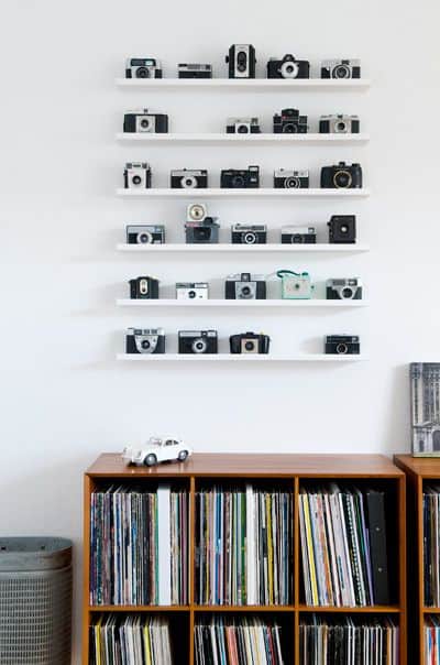
Above, a collection of old-fashioned camera's has been given pride of place, by lining them up, in an orderly manner on some picture ledges. The last two images prove that styling a display of a collection can be as simple or as contemplated as you'd like...

Image from Vibeke Design
I love the styling in the image above. Rather than being a collection of similar items, this is a more themed collection. The botanical prints on the wall is the perfect backdrop for displaying the old tin box and the big glass bottles. The collection of twines in the glass jar and the green branches ties in with the botanical scheme...

Image from Emil un die gross en schwestern
Coming back to ceramics: Just look at this gorgeous collection of white ceramic vases and vessels, above!! Perfectly arranged on that stunning mid-century modern sideboard! I also love the collection of art on the wall....but what makes this display really work IMO, is the whiteness of the ceramics against that dark grey wall!

Image from The style files
The collection of ceramics in the image above is equally beautiful! I love that there are all sorts of shapes and sizes, and the seemingly casual display looks like a rainbow of colors against the white starkness of the room. And being that they are placed on the windowsill in an easy to reach spot, makes them seem all the more part of the interior in a very tactile way!What a way to display a lovingly collected array of ceramics and earthenware! This is my sort of dream space!

....Maybe one day I will own a gorgeous collection like this, and display it with pride!
What I love about collections, is that they are not un-achievable dreams, but something that you gather and build, like wisdom, through the years....
And a collection will always be personal to you: It doesn't matter if it is pebbles and sticks found on the beach or beautifully handcrafted ceramics...Each and every piece is special, because you took the time and effort to bring it home, and by displaying your collection in a group, you are showcasing those moments , that sums up the story of you, every time you look at them!!

Friday, 12 June 2015

Win an Eames ESW style chair!

Competition!
Image via so much more than


I am happy to announce that in collaboration with the wonderful people over at Chair furniture, I am today hosting a giveaway of one of the most iconic chairs of our times:
The Eames ESW chair!
Details of how to enter this competition  further down the post!

Image from houtmerk

Originally designed by Charles and Ray Eames',the ESW chair, along with their DAW Chair revolutionized furniture in the 1950s with its unique style and grace. Taking advantage of  the development of new technologies and materials developed during World war 2, and The Eames' pioneered  the use of plywood and fibreglass in furniture design, and the DAW was one of the first  industrially produced plastic chairs in the world.
 The seat follows the shape of the body to make it more comfortable and the wooden legs are strengthened with steel. Elegant, comfortable and strong,this chair has over the years won a place among the most iconic pieces of furniture created in modern times!

Image from only deco love

It is even so famous that there has been made posters of it!!
Head to Only Deco Love to download the printable poster, pictured above for FREE!
Image from Pinterest


The continued popularity of mid Century modern design, is a testament to the quality and creative thinking behind the 1950's movement that the Eames's was spear heading.

And along with designs from their peers, such as Arne Jacobsen, Hans Wegner and Jean Prouve, the Eames plastic chairs are now firmly placed in hall of fame of modern design...

Now A staple in most Scandinavian interiors, the timeless design fits in any settings...
Image from S F girl by bay
In offices and creative workshops....Seen here, above, in the earlier offices of S F Girl by Bay's creative studio, in colored fiberglass with Eiffel style steel legs....

Image from The Urbnite

Or here in a black shell with wooden, steel reinforced legs....


In a more oldy-worldy setting around an antique dining table....they don't look out of place, but adds another dimension to the interior by juxtaposing with the rest of the decor...

Image from nordic days

Or in more modern and stark surroundings, in it's most classic, plain white option, above.
Image Via My Paradissi

UK based company Chair furniture specializes in quality replicas of iconic furniture, like the ESW, for a fraction of the prize of an original.....

 
....making iconic design affordable to the general public, and not just the wealthy elite....
Building on the ethos of the original design movement of the Eames' and their peers, to make great design accessible for all....


Chair Furniture stocks these iconic chairs in a wide variety of colors and finishes...


And all you have to do to win one is,
 like their Facebook page
then visit their site and choose your favorite chair...
Then comment on their Facebook page, or mine, or below, on this blogpost which chair you would like to win...


This competition is open to anyone living in Europe, except Switzerland (Sorry;) and will be running for 3 weeks. The winner will be dawn at random and announced on the 3rd July here at Nostalgiecat.

Image from Design o form

So, just to recap those competition rules:  
To get your hands on a piece of iconic design for your home, head over to the Chair furniture facebook page, click like and leave a comment mentioning your favorite chair from their website, either there or below here on this blogpost....

Good luck!


Ps!
You can read more about the Eames' revolutionary designs here and in my post about the Eames RAR rocker....and if you are unsure of acquiring a replica of a design classic as opposed to the real thing, you may find this post by my blogger friend Kimberley Duran interesting!

Wednesday, 10 June 2015

DIY poster hanger


In my last post I sowed you how you can make your own graphic poster for your walls...
...today I am sharing how I made the simple wooden poster frames!
These types of "clamp on" poster frames are really practical if you like to change out your art frequently, and they also take up next to no space when storing.
Save some money and make your own...it's easy!
You will need:
Wooden bead moulding , like this 
3mm brass screws and nuts x6
3mm brass washers x6
Small brass screw eyes x2
Brass chain
Ruler
pencil
 tape
Wood saw
Screw driver
A drill and drill bits (3mm and 7/8mm...or however big your screws and nuts are)
Araldite glue or other super-strong adhesive
Fine grit sandpaper
HERE'S HOW:
Cut the wooden beading to size. You'll need two lengths at the top AND bottom of your poster, so 4 equal lengths all together.
Pair up the lengths and tape them tightly together.
One pair for the top, and one pair for the bottom of your poster frame.

Use the ruler and pencil to mark out 6 equally spaced points on each pair of the wooden beading's.
Use the smallest drill bit to drill through on each spot.
By pairing up the beading and taping together before drilling, you ensure the holes will match up on the wood.


Undo the tape and separate the beading. Put the top beading to the side for now!

Now use the larger drill bit to make the holes on the bottom beading big enough to countersink the nuts. Take care not to drill all the way through.


Mix up some Araldite, and glue the nuts into the wooden beading.


Then place the top beading on top and screw the two wooden moldings together whilst the glue is still setting.


Repeat this process for the bottom half of your poster frame as well.

Whilst you are waiting for the glue to harden, use the smaller drill-bit to drill a hole on the topside at each end of the top of the "frame", and attach the screw eyes:


Use some fine grit sandpaper to gently remove any pencil marks and small splinters caused by drilling and cutting the wood.


Cut the chain to length and attach to the screw eyes.
Unscrew the frames and place the washers on the front before reassembling the frame onto the poster...


Place the poster between the wooden beading and tighten the screws to secure...


....then hang your poster!


The bottom half of the poster frame will help weigh the poster down , ensuring it will hang straight!


You can find my DIY graphic poster tutorial HERE.


I am not quite done with the art theme around here yet....bu I am going larger than ever with my next project....all shall be revealed soon!
But do pop around on Saturday, as I am hosting a fantastic giveaway....you don't want to miss it!!


IMAGE DESCRIPTION
Please vote for me for best DIY blog

"