reveal!
OK....so, as I am actually blogging from Norway at the moment, where I am having a much needed impromptu break, I have decided to cut a bit back on the planned amount of projects I wanted to do for my living room makeover as I am feeling a little worn out at the moment! So today, I am actually sharing our new and updated living space...a little earlier than planned!
But first, let me remind you all what it used to look like:
About two years ago we painted the previously red walls white, which opened up the space a lot, but because the living room is at the back of the house with only one window, it still felt quite dark....
not helped by the knackered yellowing pine floor boards...
I also absolutely hated the quasi-Victorian 8o's fire surround!
We did have grand plans about installing a wood burner in place of the dated fireplace and to get new laminate flooring installed earlier this year, but it has been a tough year for us, and we had to abandon those plans...
Another thing I really wanted , was a new sofa, but again, this was out of reach for us this year....But determined to make the best of the space we've got, I have worked hard to make some cheap improvements:
It now suits my interior taste, and has that fresh Scandinavian look that I love with my DIY stencil design (that was inspired by my gran and granddad in Norway's old kitchen tiles...)
If you look at the reflection in the mirror in the picture above, you will also notice that I've added one of my
DIY starburst ceiling rose's around the ceiling light (like the one in
our bedroom )...
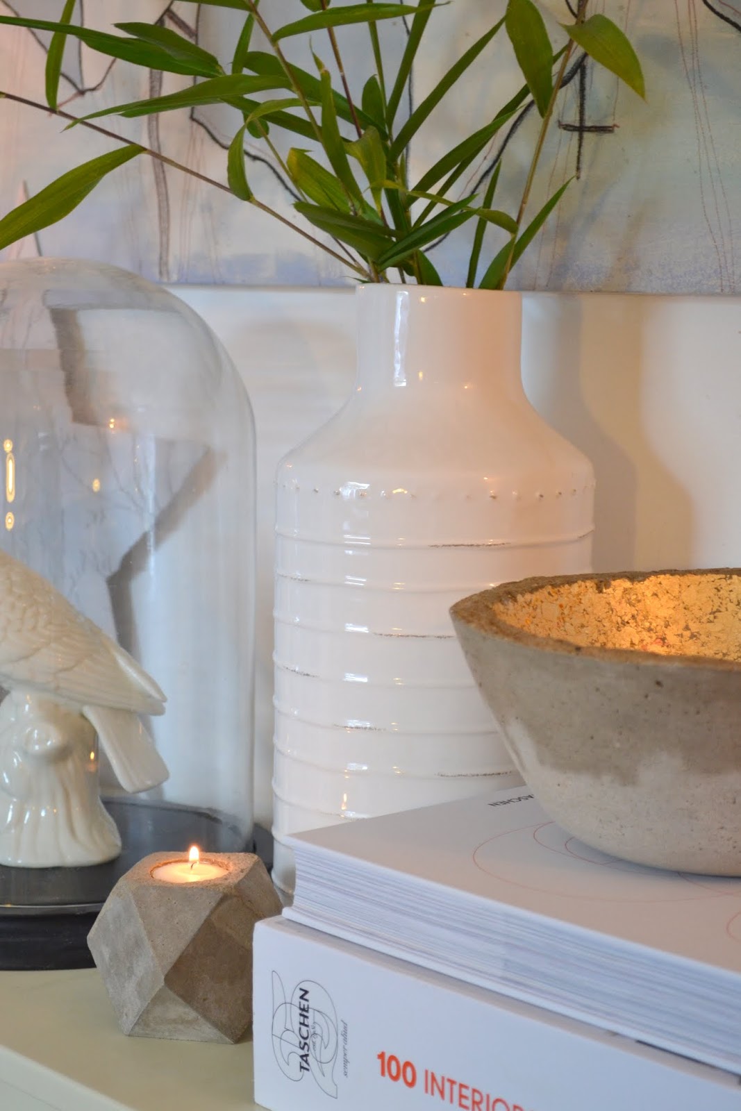
And purging my decorative items, and carefully choosing what got to stay, has also helped creating a fresh look in the room:
Sometimes, just tidying up a bit and maybe, as mentioned above, purging and carefully selecting which items to display can have a huge impact on the look of a room. Which is exactly what happened when I decided to
style the bookcase.
It is all in the detail...
...like introducing more plants and greenery into the room (bless them, for I have a black thumb!!) which has added a freshness to the space...
The "I will survive" planter, is a DIY stencil I shared with you all
here...
And some old projects, like the
concrete lampshade, and
concrete stool now has a new lease of life in my fresh new space! You can also learn how I made the Geometric and Ampersand artwork
here!
And of course the other old sofa got a new
DIY sofa cover, with the addition of some new, matching squishy cushions, making it not only more stylish, but also a whole lot comfier...
And finally having a
little side table next to it means no more tripping over drinks on the floor...I love this little bargain buy from Tesco!
I will be sharing the big textured geometric artwork in my next DIY post!
But first I have some exciting news I'd like to share: Post to follow later in the week!!
What do you all think of my new look living room?
I've spent less than £200 to get it from the before to the after: and that includes the floor, the fireplace and all the other little projects + any new items, such as the side table...
Not bad, hey?
I hope that even if it's not to your exact taste, it shows you how you can transform a space...even when working on a very tight budget!


